Level Design - Pablo Campos
Hi everyone,
Today I will show you the new design of the new first level.
During the play testing we found that an extensive map, based of 3 large areas, produced too much downtime.
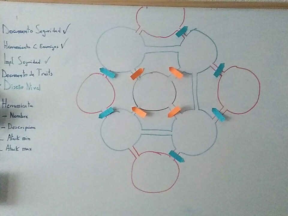
For of this the new map will have a shape more similar to an archipelago, with small areas joined by different paths

The paths with the orange sticker will be accessible before the blue ones, thus controlling the pacing of the game.
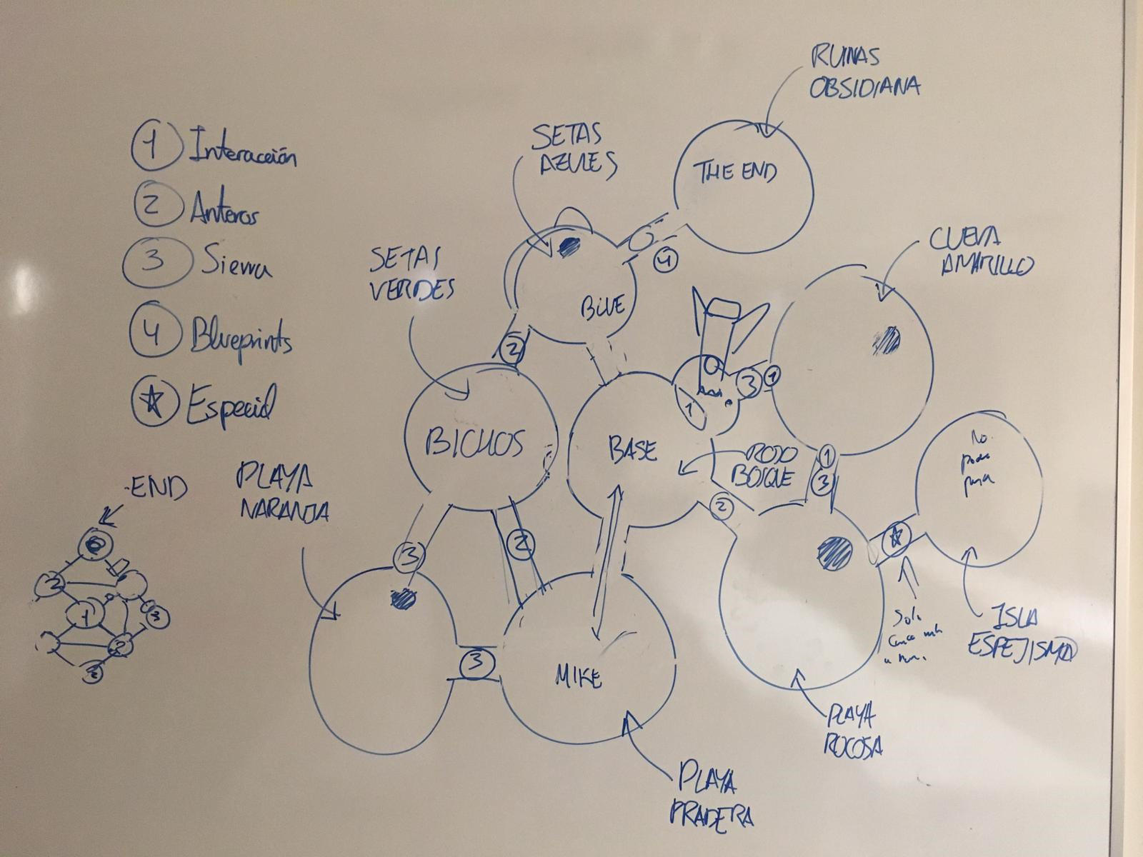
After closing the narrative of the level, the map was adapted.
In this part we will not give more details for not doing a spoiler.

Finally we think how would each of the zones be visually and their feel.
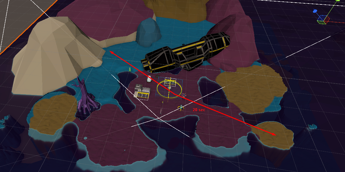
Now is the time to create the structure in Unity.
We wanted this level to be fast and short, so going from one end of the map to the other takes 20 seconds.

There are only two things to do:
- 1 Decide the number of resources that each zone will have.
- 2 Decorate each zone
Goodbye and thanks for reading,
PABLO CAMPOS
KATHARSIS
A real-time management game on an alien planet where an AI must keep a group of humans alive
| Status | Released |
| Author | WIP Studios |
| Genre | Survival, Adventure |
| Tags | 3D, Low-poly, Real-Time, Singleplayer |
More posts
- First playable buildFeb 10, 2019
- Programming - Marcel - Spatial ground UI: Sprite vs Decal vs ProjectorJan 21, 2019
- Rafael -New Security System ImplementedJan 20, 2019
- Yeray - Art - UI RedesignJan 12, 2019
- Programming - Marcel - Event and item toolsJan 12, 2019
- Art and Design - Yeray - New levelDec 17, 2018
- Programming - Pablo Campos - AI GarabooDec 17, 2018
- Art - Rafael - New changes to UI after playtestingDec 05, 2018
- Programming - Pablo Campos - Security SystemNov 20, 2018

Leave a comment
Log in with itch.io to leave a comment.