Art and Design - Yeray - New level
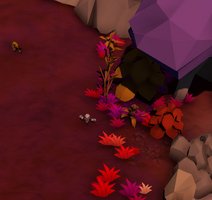
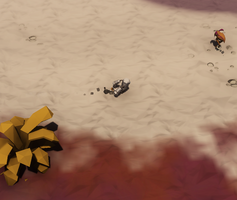
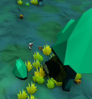
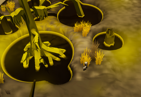
Hey guys! I'm Yeray, a designer of the WiP team who is organizing how to Art team works, and designing the levels of the game. I have previously wrote down a Devlog about the first draft for the UI (Check it! https://wip-studios.itch.io/katharsis/devlog/56701/art-yeray-ui-design) , and now i will show you how i am creating the gameplay level. If you want to know more, feel free to suggest ideas or ask any questions related to our work!
So, the first playtesting had a first level that was created in a rush almost. I spent a lot of time playing with the new models and textures that we had just bought for it, and the "design" of the map wasn't something that function properly in some aspects. Then, for the second playtesting i decided to throw away the entire first level, and create something new from the scratch.
This second level is composed by three zones
- The first one, with red and purple tones, that works as a "tutorial" zone for the player and has a lot of food in form of berries and some Garaboos (animals). It has a little beach on the north part of it, and when the escape pod arrives the planet (event), an log entry appears on the cost.
- The second one, with blueish and greenish tones, and a lot of wildlife in form of different types of mushrooms. Here, the player can find a new type of food, the mushroom. It only appears on this zone, and produces a lot of nutrition, stamina and rations in comparison with the berries. Here the player has to collect a deposit of Anteros to get one of the log entries.
- The third one, with white, black and yellows, produces an ambience more agressive for the player thanks to the use of yellow and a lot of dead trees. Here the player can find a lot of Carbon deposits, which are the base for the economy of our game. This is the only zone that has "ruins", which on a latter version will mean the presence of older alien technology.
Now we have the feedback for our last playtesting, and some discussions about how the level of the vertical slice of "Project Katharsis" will be. With that feedback, we have thought about creating a level with less size and more density. This will let us cut the daytime, and create more beautifull and interesting zones.
I will create more devlogs in the future talking about this subject. Until then, have fun!
KATHARSIS
A real-time management game on an alien planet where an AI must keep a group of humans alive
| Status | Released |
| Author | WIP Studios |
| Genre | Survival, Adventure |
| Tags | 3D, Low-poly, Real-Time, Singleplayer |
More posts
- First playable buildFeb 10, 2019
- Programming - Marcel - Spatial ground UI: Sprite vs Decal vs ProjectorJan 21, 2019
- Rafael -New Security System ImplementedJan 20, 2019
- Level Design - Pablo CamposJan 20, 2019
- Yeray - Art - UI RedesignJan 12, 2019
- Programming - Marcel - Event and item toolsJan 12, 2019
- Programming - Pablo Campos - AI GarabooDec 17, 2018
- Art - Rafael - New changes to UI after playtestingDec 05, 2018
- Programming - Pablo Campos - Security SystemNov 20, 2018
Leave a comment
Log in with itch.io to leave a comment.