KATHARSIS
Yeray - Art - UI Redesign
Hey guys! I'm Yeray, a designer of the WiP team who is organizing how the Art team works, and designing the levels and UI of our game. I have previously wrote down a Devlog about the first draft of the UI (Check it! https://wip-studios.itch.io/katharsis/devlog/56701/art-yeray-ui-design) and another one on level design (Here it is! https://wip-studios.itch.io/katharsis/devlog/60500/art-and-design-yeray-new-leve...). Now, for this devlog, im going to update you guys on how the second version of our UI is going to be.
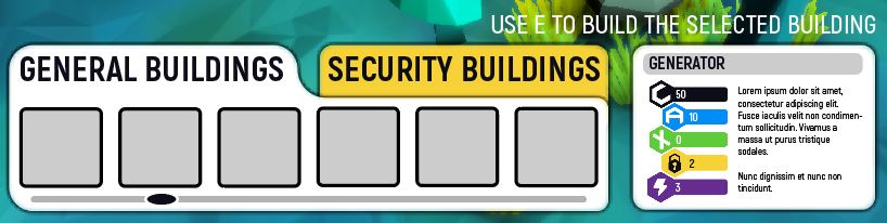
One of the main problems that our game has, its that the player needs a lot of information about what is going on and the consecuences that his or her acts have. Because of that, our UI has changed a lot since the last version. The older one had some feedback problems, and we the team decided to change the general style of it. So, in comparision to the second playtesting version, the new UI has:
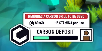
- New Icons: Carbon, Anteros, ZX-22, Security, Danger, Energy... all of this and more will be added to the last version
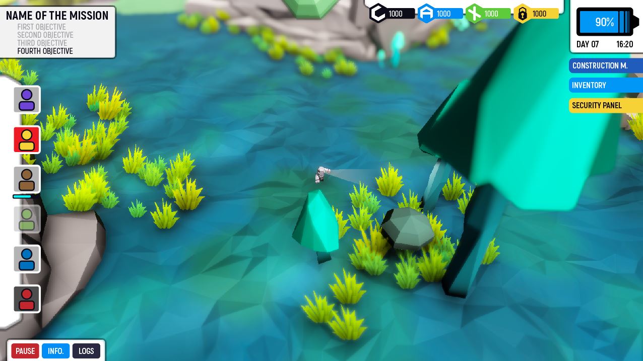
- Energy instead of time: On older versions, we showed the "in game" time to the player and a loading bar in order to show him or her when the day was going to end. Because it generated some problems to our playtesters, we have decided to prioritize the bar that shows the end of the day, instead of the "in game" time, which now is displayed bellow this energy bar.
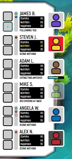
- New Crew Status: We have changed how many information this panel shows to the player. This is probably the most complicated part of the new UI, because it has a lot of really usefull data that the player will need to know properly in order to distribute his crew power effectively.
- The interaction panel is no longer diegetic: On older versions, this panel was created inside the game world, but it created a lot of perspective and visualization problems because some panels appeared inside the nearby objects. Because of that, now the interaction panel will appear in the bottom part of the screen when the player is near an intaractuable object.
- New Style: We wanted a very simple and clean UI design, but because of our time limits, I didn't had a chance to properly create an interesting but functional UI. Now that we are getting closer to the style we first had in mind, the new UI has some forms and colors that truly make them
And that's it! You can see some images of the UI on the top of this Devlog.
Thanks, And see you in future logs!
KATHARSIS
A real-time management game on an alien planet where an AI must keep a group of humans alive
| Status | Released |
| Author | WIP Studios |
| Genre | Survival, Adventure |
| Tags | 3D, Low-poly, Real-Time, Singleplayer |
More posts
- First playable buildFeb 10, 2019
- Programming - Marcel - Spatial ground UI: Sprite vs Decal vs ProjectorJan 21, 2019
- Rafael -New Security System ImplementedJan 20, 2019
- Level Design - Pablo CamposJan 20, 2019
- Programming - Marcel - Event and item toolsJan 12, 2019
- Art and Design - Yeray - New levelDec 17, 2018
- Programming - Pablo Campos - AI GarabooDec 17, 2018
- Art - Rafael - New changes to UI after playtestingDec 05, 2018
- Programming - Pablo Campos - Security SystemNov 20, 2018
Leave a comment
Log in with itch.io to leave a comment.